
Designing for Today’s Audience: Why Mobile Design Comes First
- Megan Aguilera
- Nov 10, 2025
- 2 min read


We live in a generation that values accessibility and efficiency more than ever. People are constantly on the go, and they want fast, easy access to information at their fingertips. That’s why having a mobile-friendly site is so important. It’s often the first impression your business makes, and if that experience is not user-friendly or not visually appealing, visitors are likely to leave before seeing what you offer. Or worse, it can hurt your reputation, making people less likely to visit your site again or trust your brand in the future.
Examples of Great Mobile Website Design
Two strong examples of effective mobile website design are Amazon and Porsche. Both companies have a seamless mobile experience that fits their brand identity, keeping users engaged and satisfied.
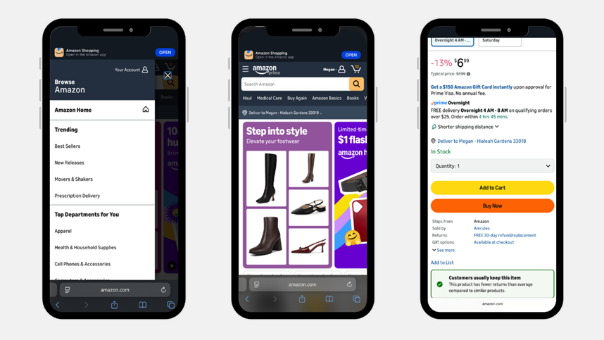
Amazon’s mobile website stands out for its speed, clarity, and functionality. The design focuses on convenience, allowing users to search, browse, and purchase products quickly and effortlessly. Everything from the fixed search bar to the one-click checkout is optimized for users to be able to shop on the go.

Porsche’s mobile website takes a luxurious, minimalistic approach focused on usability. The layout makes it simple to explore models, customize designs, and locate nearby dealerships or test drives. Clear visuals and intuitive navigation help users find exactly what they want quickly, creating an effective browsing experience.
Both of these websites have excellent mobile versions, yet they are completely different. This shows that great web design isn’t one-size-fits-all. Both succeed because their mobile experiences align perfectly with their brand identities and audience expectations.
For more examples of great mobile website designs, check out this article by Rachel Leist on HubSpot:
Tips for Designing the Mobile Version of Your Website
Keep it simple – A clean, organized layout helps visitors find what they need quickly.
Prioritize speed – Compress images and streamline features so your site loads fast on all connections.
Make navigation effortless – Use clear menus and visible buttons for easy browsing.
Design for touch – Ensure clickable elements are large enough for fingers, not just cursors.
Stay consistent with your brand – Match your colors, tone, and visuals to maintain recognition and trust.
Optimize for one-handed use – Place important buttons and actions where thumbs naturally reach.
What to Remember
No matter how great your website looks on a laptop, if the mobile experience falls short, you’re missing out on a huge portion of potential customers. A good mobile version of your website ensures that your business looks professional across every device and is easy for your audience to access anytime, anywhere.
To better understand your online audience, check out my post, The 4 Types of Website Traffic That Can Transform Your Business. It breaks down the different types of traffic your website receives and can help you see why having a strong mobile version is so important.
At Elevate with MGM, we’re here to support every part of your marketing journey, and that includes building websites that leave a lasting impression.


Comments